The following is the link to my PDF. On this you will find all that KAL has to offer, it’s key features as well as links to the Animation and the Landing Page. I was really happy with the overall design of the PDF, I think it looks very professional yet attractive. I would use a similar design for brochures and leaflets to help further promote my app.
The Mock-Ups
This is a more professional mock-up of my calendar interface. Whilst this is not a practical design, it is a good looking one that I would use for promotional material.
This image shows some of the bonus features for KAL.
Meal Planner – Using rounded squares, the page looks professional and all you need to do is scroll down. A plus icon is in place of an empty day so you know to click on it to fill it in. In a functional app, whatever meal is added updates on the calendar to show the children who would not have access to this section of the app.
To-Do List – A simple check-list system, this app is recognisable and so easy to use. Like the notification system for the calendar events, the same can be attached to the to-do list items so can get notifications for them.
Shopping List – Follows the same functions as the to-do list without the notification ability. Can be sent to email to get printed off.
Notifications – The events from the calendar can be set to give you a half hour prior warning in case forgotten.
The Animation
Another great way of advertising my app if it were to go live is through a commercial.
This ad is a good example of a simple way to advertise an app. With a minimalist style it has a nice level of interactivity to make the app look interesting. I like the way it displays how the app functions on the phone so I think I will use this in my video as it is a realistic way of displaying it.
This commercial uses a lot of animation to present some information to go along with a narration. Whilst I like the animation I feel as if there is too much and that it goes on for too long. I think I will make my commercial an animation but simplify it into a 30 second commercial and have a narrator to introduce it.
Here is my finished animation for KAL. I incorporated all the things I liked in my research and I am happy with what I have produced. Whilst it is not the detailed of animations it is attractive and follows a nice narrative. I think my animation would help to promote my app successfully and would look good on my social networking site.
The Landing Page
To help visualise my app I created a landing page for those interested in the app and who want to learn more.
I created the site on Adobe Muse and published it using the business catalyst. It was the first time I used this piece of software and it was surprisingly easy to use due to no coding required to set up a good looking site.
When I got used to working the site I explored the widgets it had to offer and decided to incorporate the Facebook like button and a simple button to take the user to the animation.
I created lot’s of mock-ups of the app display to help visualise how the app works. I put these in my Landing page have put them in my Facebook posts too to help persuade people to download the app.
I have also included images of buttons that would send you to the apple store or Google play however they are not active as the app is not currently available.
The Social Network
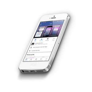
I have created a Facebook page in order to help promote my app. Facebook is a great way of getting some initial responses and feedback to my app as well as a great way of recording the awareness of the app.
The following link will take you to the Facebook page:
https://www.facebook.com/KAL-1573506552978770/


